What The Heck Is
Responsive
Web Design?

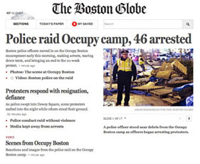
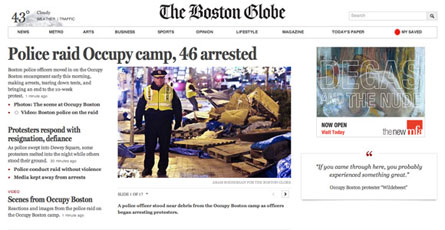
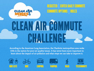
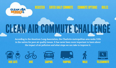
Responsive websites
respond
to their environment
Adaptive
(Multiple Fixed Width Layouts)
or
Responsive
(Multiple Fluid Grid Layouts)
...or
Combo
Fluid Width
Small Screens
+
Fixed Width
Medium & Large
Why?
“Day by day, the number of devices, platforms, and browsers that need to work with your site grows. Responsive web design represents a fundamental shift in how we’ll build websites for the decade to come.”
Small + Medium + Large
One Site
For Every Screen
Who?
Not just demos, design shops and vanity pages
Real Client Work



Barack Obama
The Obama campaign continues to be at the leading edge of web technology
barackobama.com
...and plenty more
http://mediaqueri.es
When?
Things to Consider
Time & Money
Browser Support
Performance
Content
How?
“Stop Thinking in Pages.
Start Thinking in Systems.”
Frameworks
(Save Time)
or
Roll Your Own
(More Control)
Best Practices
Content Check
Start Small
Mobile First
Exit Photoshop
Enter Browser
Think Modular
Always Be Optimizing
*Best practices still emerging
Where?
Credits
an impress.js presentation by John Polacek
Responsive Web Design Graphic by Bakken & Baeck
Responsive Web Design Book published by A Book Apart
Jeremy Keith quote from The Web Ahead Podcast
Jeff Veen quote from a review of ’Responsive Web Design‘
Open Sans Font by Steve Matteson
impress.js created by Bartek Szopka
